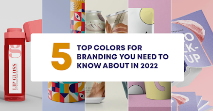
5 Top Color Trends for Branding You Need to Know about in 2022
BRAND. That’s all that matters when you are about to start a business. We all know what a brand is, but do you know the biggest obstacle in the branding process? - “What color should I choose?" Branding is critical to defining who you are and what you are offering to the customer. Brand colors are especially important when it comes to your company’s communication and digital marketing strategy.
Why do I have to choose a brand color?
Think of the newspapers from a decade ago that used to be printed in white and black. Didn’t it feel like the newspaper was boring, lacking emotions, and very monotonous in nature? That’s exactly how a void of color affects a brand. Brand colors are used to portray the expression and emotions of a brand. Mostly, the brand's communication when implementing its digital marketing strategies in the future is solely dependent on the colors that are initially chosen.
You will notice that recently, several brands have opted for a complete makeover with a rebranding strategy to boost their physical and digital presence. There are several reasons why a brand chooses to implement a rebranding strategy and go through all the efforts to distinguish itself in the real and digital marketing world. Most importantly, irrespective of their reason, the fact that colors have to be chosen for branding and rebranding to accurately represent the brand does not change.
What are the top 5 brand color trends for 2022?
In recent years, we have seen loud, going-out-of-the-way, bold, unique, and focusing out-of-the-box color combinations that were opted for by many startups and brands around the world. The trend of pastels, especially in digital marketing, interestingly drives avid engagement from viewers. Of course, we’d like to mention that branding colors for digital marketing are completely dependent on the type of design strategy that is implemented by a company.
1. Minimalism
With so much range in brand colors - from loud colors to questionable combinations—many organizations today have decided to dial it down a bit and stick to a minimalistic approach for their branding strategy. Mostly used for companies that are in the selling business of physical products, minimalism works well for them. In some cases, marketing strategies for beauty brands also see a shift toward using minimalism as the best way to show off and engage their audience with their products.
2. Muted Colors
Following the path of not utilizing vivid colors anymore, the trend of muted colors was born. Muted colors are basically desaturated colors that are neutral and more earthly in their color palette. These muted tones are perfect as brand colors for all-natural and earthly associations with them. Muted colors are hushed and mellow, quite the opposite of pastel colors, and they emit an overall warm emotion.
3. The Comeback of Flowery Designs
Recently, flowers have made a brand new entry into the design world with wreath-supported minimalistic flower designs. Several new brands during the pandemic have adopted the use of small flowers, wreath designs, and organic elements to brand themselves. Flowery hues with toned down, pastel and muted colors continue to be the basis of many eye-catching brand designs.
In fact, flowery
designs are becoming a preferred trend when it comes to digital marketing.
Brands who use this sort of design as their base are known to have a more
aesthetic appeal to them and portray that efficiently on all their social media
pages and communications.
4. Bridge Between Vividity and Pastels
Pastel colors, a
popular trend that made some major companies rebrand themselves to “fit in” are
changing little by little in their outlook. Instead of light pastel colors,
brands are shifting to a mix of pastel and vivid colors.
Basically, a color
that is between pastel and vivid. Like a purple which is between completely dark purple and mauve. The
idea behind changing the outlook of pastels was to introduce a new set of
gentle colors that were pleasing to the eye. Many brands today have utilized
this sort of color range in their digital marketing approach.
5. Hyper-saturated Color Contrast
A new pop-in design that disregards all the traditional rules that branding follows. In this type of color trend, colors are mixed and matched at random and are usually hyper-saturated. Brand colors go beyond the typical color combinations that are pleasing to the eye and take up eye-grabbing vivid colors. This type of branding captivates the viewer and entices them into a fun and exciting journey with the brand.
Branding for
companies is essential and choosing the right brand colors is key to having a
long-term emotional connection with your audience. If you’re still wondering
how you are going to brand, leave it to Digikore Digital. We help you choose
the optimum brand color that will assist you in establishing short-term and
long-term digital marketing strategies to spread your brand awareness and
generate the sales that you wish to see. Contact us today to get a digital
marketing plan optimized for your needs.


Comments
Post a Comment